Pages

Tuesday, March 26, 2013

More practice UPDATED 4

It's just a sketch for now--some guys sitting around the fire. I wonder why they haven't taken their boots off if they took off their hats and coats?

Thought I'd upload this as a sketch...just in case I somehow ruin it when I line/value/color it.


Edit: Rough value looks okay so far so I thought I'd put it up. There'll be more contrast later but this is the first pass for the background

Edit 2: Background value and detail are pretty much done, and basic shadow/highlight on the left character are done, but I've only put the proper value on his shirt so far


Edit 3: Both characters' value is done, the background is done...all that's left is noodling some details onto those books maybe, making the carpet a carpet, adding a rose and coatrack behind the righthand character...oh and color.

So, still a long way to go...but it's getting there.


Edit 4: Okay, I did all of those things so the value phase is done...finally...but I'm also back in classes so the colors will prolly take forever...
Bigger image this time.


One-Hour Practices

Hah, I'm always working on these so that I can see both pictures on the same canvas, and I pretty much never zoom in, not enough time to noodle over details...

...but some of them are large images, I'm realizing, and look pretty terrible up close. I'll have to shrink future ones, since they're really only supposed to be ~2000 pixels in any direction.

Hmm now that I'm on break and can draw whatever I want, I don't know what to draw, so I guess I'll just keep doing these practices. Can never have too much landscape practice! Especially clouds...

Today's Practice

1.5 hours. I spent too long on some parts, oh well. It's a bit of a complicated landscape.


Thursday, March 21, 2013

Today's Practice

I kind of lost interest after I did the water, which is a shame. I'll have to do this one again sometime, because I really like this picture.

The lights are so bad! I was really rushing at the end...

Wednesday, March 20, 2013

ART251 Creature: Okami

An Inugami named Okami for Character Design. I decided to do the least wolflike thing I could think of, a sort of cross between Scottie, English Sheepdog, and Komondor. It was fun! :3


Saturday, March 16, 2013

Today's Practice: Volcano

The top of my monitor is a lot darker than the bottom part (because I sit lower than my monitor) so if I do vertical separation like on this picture, sometimes I make mine too dark by comparison, because that's how dark it looks from my view--and then I put it on my other monitor and I'm like...oops...
But my other monitor is a TV, so the resolution is weird and Photoshop won't adjust properly and things get cut off when I try to work on it so I'll just keep on using my main display...yeah...


Volcanoes are awesome. So are meteors.

Wednesday, March 13, 2013

Tuesday, March 12, 2013

Practice

I've started doing one-hour environment studies. I've just been doing these based off pictures I've found on the internet, and I'm not claiming the original images, nor do I remember where I got them (probably reddit). I haven't been doing them for very long, obviously, and I've missed a few days, and I've left one out that I'm planning to make into a more finished-looking piece.
The two without reference pictures are actually from a few months back.

So here's some of my practice, then.


The wedding photo took longer than an hour and I was practicing with square brushes.
Journey picture speaks for itself; that game is amazing.

First of the new set.


Based on this person's style: http://tohdaryl.deviantart.com/ 

I try to be accurate to a fault but I made the radiator brighter and I like it better.

I want to try redoing this in Yasuyuki Honne's style some time...


No fish because this one took longer than an hour and I was tired of it. There's way too much going on even in the foreground, I got lost.


EDIT: Did this one today.

Wednesday, March 6, 2013

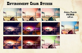
Environment for Projects Class

Animation Background for Project's Class. Went through a lot of changes...


Character Design Villain

I had more fun with this one. It's much better, too. Red Oni to Makoto's Blue Oni.